Tudor Black Bay Photography Project
Product photography and visual storytelling for a classic dive watch.
Role: Photographer, Visual Designer
|
Duration: X - Y Weeks
|
Tools: Sony ZV-1, Studio Lightbox
|
Context: University Project
|
Role: Photographer, Visual Designer | Duration: X - Y Weeks | Tools: Sony ZV-1, Studio Lightbox | Context: University Project |
Project Overview
Having an existing interest in photography, this design visualisation project was one I was particularly looking forward to completing. The goal was to capture a series of compelling product shots using the Tudor Black Bay watch. I initially started shooting without a strict plan, capturing everyday casual shots around the university campus. However, I quickly realised that these environments felt too casual and did not reflect the rugged, tool-watch character of a dedicated dive watch, prompting a shift toward more specialised studio and underwater setups.
Exploration/Discovery
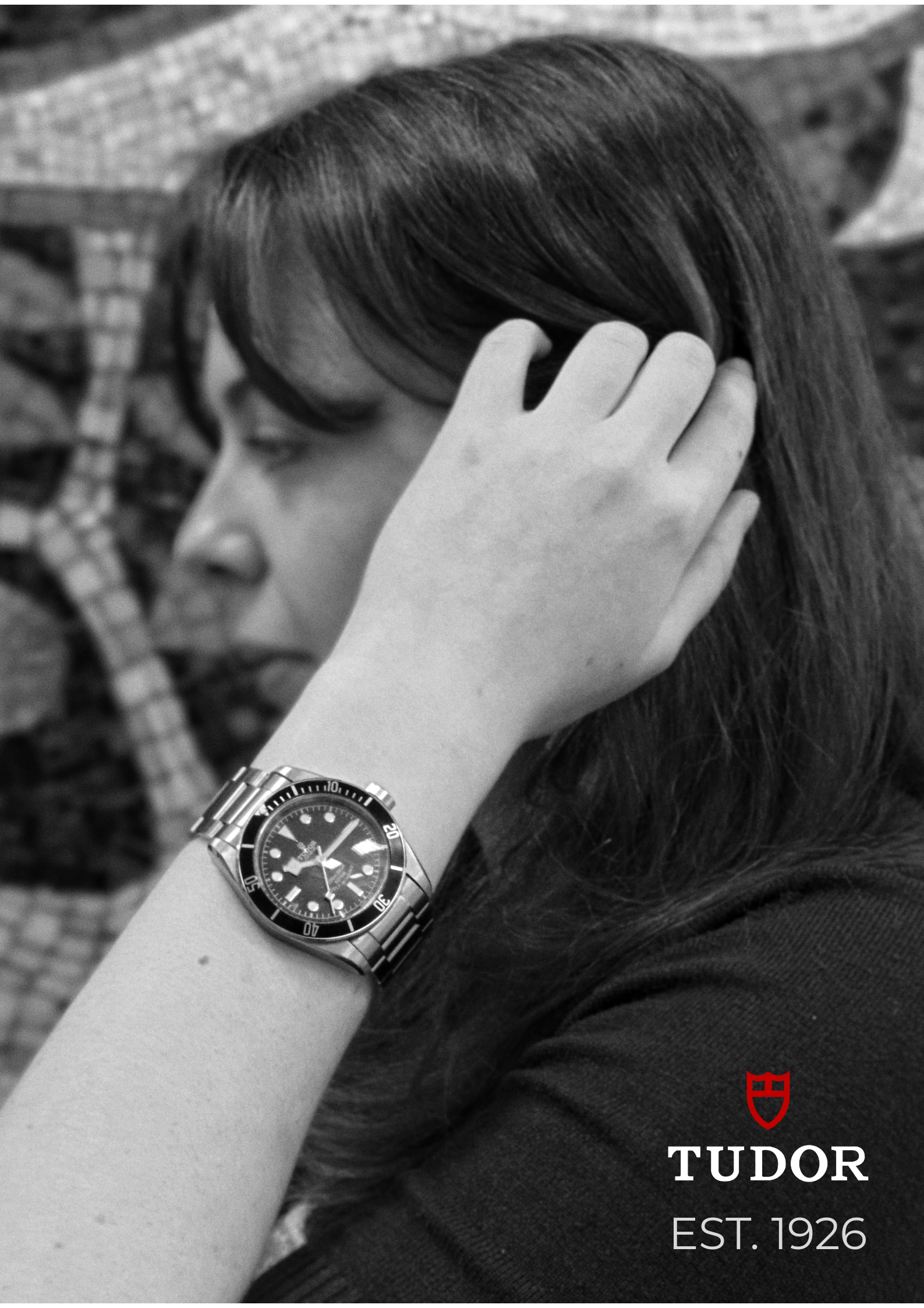
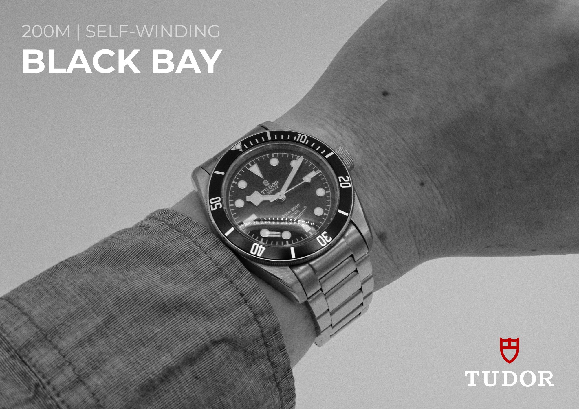
My early outdoor shots demonstrated everyday wearability, but I struggled with the camera's autofocus occasionally locking onto my sleeve rather than the dial, resulting in a loss of sharpness on the watch face. I transitioned to using the studio lightbox, shooting against a plain white backdrop at f/3.5-5.6 and ISO 100-200. Isolating the watch on a clean background allowed the bracelet texture and bezel details to read clearly. I also captured unplanned shots against a mosaic wall outside the studio, discovering that the rich texture of the mosaic contrasted nicely against the watch. I used a borrowed Sony ZV-1 camera across all of these different environments.
Design Process
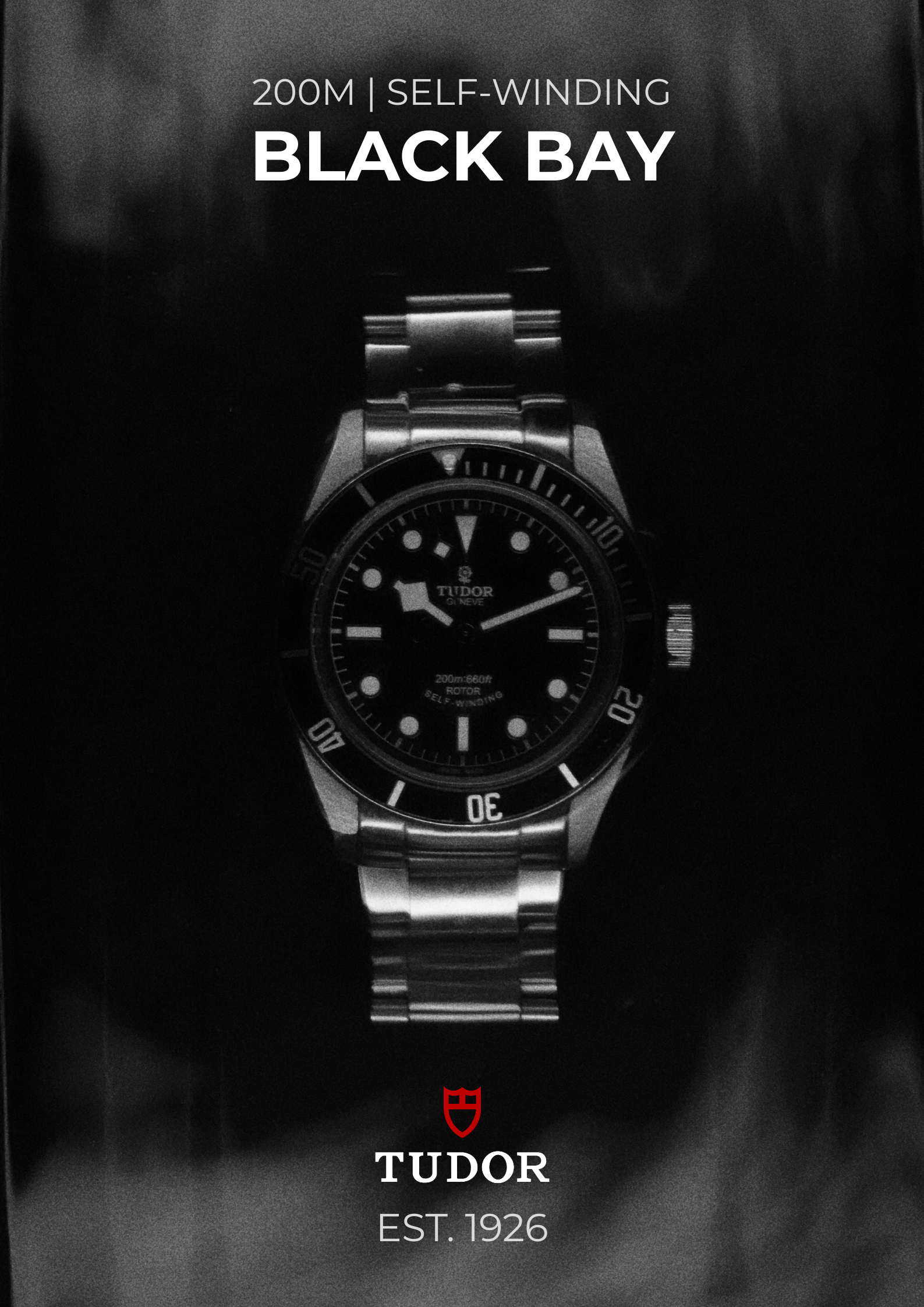
To properly capture the dive watch aesthetic, I built an underwater container rig using a glass bowl with a light source positioned directly beneath it to create an isolated dark background with subtle underlighting. Getting the exposure right took a significant amount of trial and error, as the bottom light kept blowing out in the center of the frame. I had to carefully reposition the backlight a dozen times to avoid a hot spot appearing as lens flare. Once correctly balanced, this challenging setup produced exactly the moody, high-contrast visual result I was aiming for.
Final Design
The final deliverables consisted of three distinct presentation posters. I applied a black and white conversion to all three final images to tie the series together, knowing that the varied lighting conditions across the outdoor, studio, and underwater sessions would have looked disjointed if left in colour. The underwater shot became Poster 3, which is the final image I am happiest with because the watch truly looks like it belongs in that environment.
Impact & Reflection
The posters came out largely how I had imagined once I finalised my shooting strategy and stopped relying on casual outdoor setups. The primary lesson learned was the importance of matching the photographic environment to the product's specific character and intended use. If I were to repeat the process, the main thing I would change is the lighting on the underwater rig. Adding a second light source specifically to highlight the bezel detail would have pushed that final poster even further.