Outgrown: Kids' Clothing Circular Economy Platform
Designing an efficient peer-to-peer marketplace for buying and selling secondhand children's clothing.
Role: Lead UX/UI Designer and Researcher
|
Duration: June - August 2026
|
Tools: Figma, Paper Wireframing, Digital Wireframing, Low and High-Fidelity Prototyping
|
Context: Google UX Design Certificate Project
|
Role: Lead UX/UI Designer and Researcher | Duration: June - August 2026 | Tools: Figma, Paper Wireframing, Digital Wireframing, Low and High-Fidelity Prototyping | Context: Google UX Design Certificate Project |
Project Overview
Parents frequently need to cycle through children's clothing due to rapid growth spurts, but existing online marketplaces are time-consuming to list on, lack quality control, and present fragmented shipping logistics. The goal of this project was to design a highly efficient mobile application and responsive website that simplifies the photo-to-listing workflow for sellers while implementing clear verification metrics to save buyers time and money. The resulting platform, OutGrown, provides a streamlined and trustworthy marketplace where busy parents can easily declutter outgrown items or purchase affordable outfits.
Exploration/Discovery
I conducted primary qualitative research by interviewing four parents with young children to understand their habits and frustrations regarding the secondhand clothing market. My initial assumptions were challenged when the data revealed that sellers are primarily deterred by the sheer volume of low-priced items, making individual listings feel logistically exhausting and not worth the hassle. Conversely, buyers hesitate to purchase peer-to-peer due to poor visual presentation in user-uploaded photos, wildly inconsistent sizing across brands, and a lack of trust regarding hygiene and return policies compared to major retail stores. I developed two personas, Grace and Julie, to represent these distinct seller and buyer needs, ensuring the platform would address the volume-versus-value problem for sellers and the trust and guarantee deficit for buyers.
Design Process
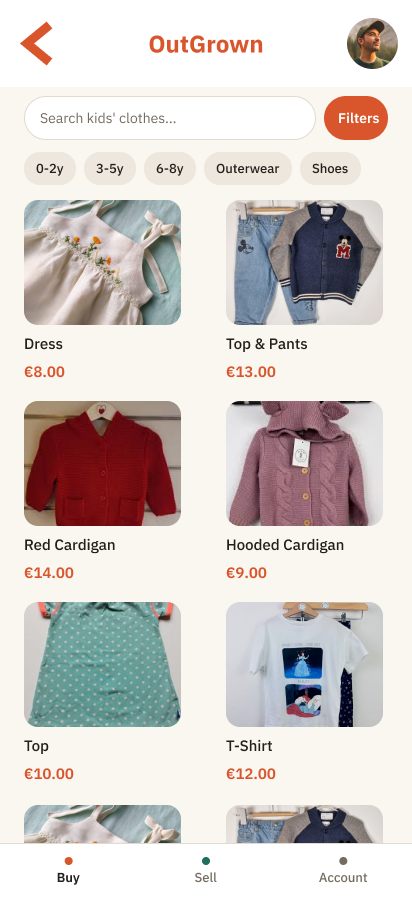
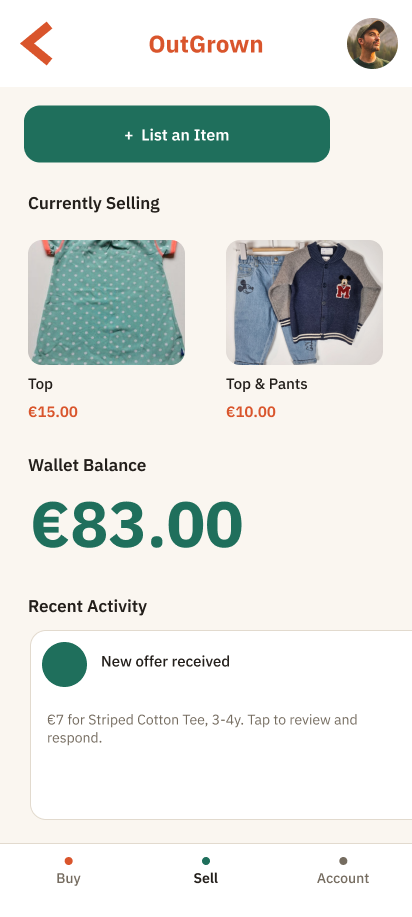
I began with paper wireframes to test a core structural decision: splitting the app into distinct "Buy" and "Sell" modes right from the entry screen, which allowed users to self-select their goal immediately. The digital wireframes carried this forward, giving the Buy mode a familiar shopping-app layout with a search bar and scrollable grid so buyers wouldn't have to navigate a new layer of unfamiliarity. The Sell mode was designed as a dashboard showing wallet balance and current listings front and center, rather than opening straight into a listing form, directly addressing the seller's volume fatigue. I conducted a moderated usability study with four parents using a low-fidelity prototype; the findings confirmed the core navigation was intuitive but highlighted that the buying homepage needed filters and the "Add item" button placement needed adjustment.
Final Design
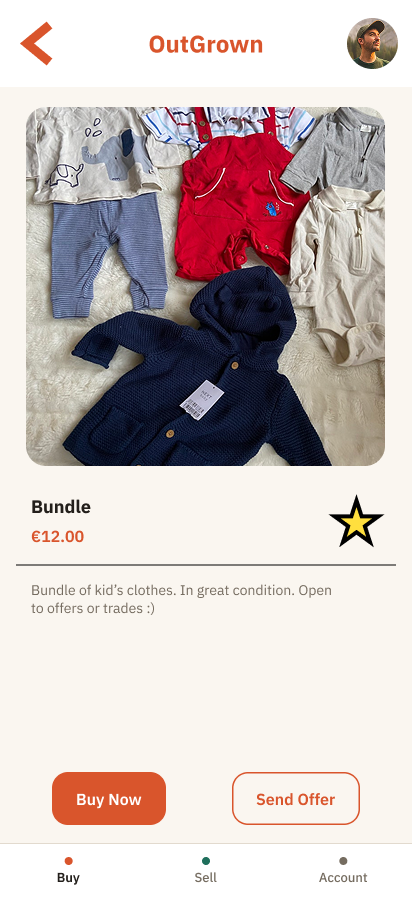
The high-fidelity mockups successfully integrated the usability findings by adding a robust filter row to the buying homepage, relocating the "List an Item" button to the top of the selling dashboard, and establishing a persistent tab bar for navigation. Accessibility was a major focus in the final UI; I sized up all small text using the highly readable IBM Plex font family and ensured that distinct, high-contrast accent colors for buying and selling were reinforced with text labels. Additionally, I separated ambiguous actions on the item page into distinct "Buy Now" and "Send Offer" buttons to eliminate confusion for screen readers and low-vision users.
Impact & Reflection
As this was a coursework project, I measured impact through the successful resolution of all three initial usability findings in the redesigned prototype. A major takeaway from this process was realizing how a single usability finding can reshape an entire screen—relocating just one button and adding a filter row measurably changed how intuitive the user flow felt during testing. It also fundamentally reframed my approach to visual polish, teaching me that contrast, spacing, and typography scale are critical accessibility requirements rather than just a final coat of paint. Next steps for the platform would involve a second usability study, fleshing out edge cases like disputes and refunds in the account dashboard, and extending the design to a responsive desktop website.